Principles of Elements of Design: In this project, I used lines to create the illusion of depth, and also used a green color to create emphasis on certain parts of the image. Also, value was made by putting the tracing paper on top to make the black paper appear to be gray as well. I used repetition in the lines to create the illusion of depth.
MASTERY: I think I could have added more tracing paper and I also think I should have made the lines get even smaller so that the depth would have been easier to see.
RELATE: This project is similar to the collage because on both of them, one of the main points was to create emphasis.
Friday, October 10, 2014
.jpeg)
Collage
Principles and Elements of Design: For this project, we had to use isolation, placement and scale to create emphasis. For the first picture, I used isolation by using complimentary colors (orange and blue). I also used placement by putting the triangles in a diagonal line, pushing the shapes upward. For the second picture, I used scale by putting a giant owl in the center of the picture with a creepy masked figure on top, to emphasize how big the owl actually was. I also used placement by putting the figures in the center.
MASTERY: I think I could have made the backgrounds a little more interesting and I also think that I should have put the gloss medium all over the page, and not in just a few areas.
RELATE: This assignment relates to the foreground/background assignment because I used complimentary colors and focused on the placement of the figures.
Thursday, October 9, 2014
Grayscale Portrait
Principles and Elements of Design: For this project, we used value by using the ink and adding water to make tints of the black ink, and adding more ink to make is darker, which gives it the illusion of shadow and light and also gives it the illusion of depth. The shapes are also organic because there are not sharp straight lines, and everything is rounded and curvilinear.
CRAFT: I tried to not color outside the lines and make everything smooth and neat.
MASTERY: My brushstrokes were a little messy and visible so I think I could have cleaned it up a bit to make the colors more solid. Also, sometimes the ink would fade out and I would try to make the same color but the colors wouldn't match up, but I tried to match the colors as best as I could.
RELATE: Relates to the organic and geometric shapes project both of the projects required that you make value, but instead of adding white, I just added more water to make grey in this one. Also, in this project, there were organic shapes.
Foreground and Background
Principles and Elements: I used space by using complimentary colors to show relation of the foreground to the background. I also used line and made the shapes very geometric because the lines are very sharp and straight, and there are no curves. For color, I just made the two colors purple and yellow, which are complimentary on the color wheel. And for value, I made the yellow much lighter than the purple by adding white and a little bit of blue so that the yellow wouldn't be too bright and vibrant.
CRAFT: For workmanship and attention to detail, I made sure to tape all of the edges and sides so that they lines would be as straight as possible.
.jpeg) MASTERY: I think I could have made the backgrounds a more solid color because some of the brushstrokes are still visible, and I could have cleaned up some of the white spaces in one of them.
MASTERY: I think I could have made the backgrounds a more solid color because some of the brushstrokes are still visible, and I could have cleaned up some of the white spaces in one of them.
RELATE: I think this assignment is similar to the organic and geometric shapes project because the shapes in this project are very geometric and solid. Also, I changed the colors of the yellow and purple by adding white so that it made a tint of that color as well.
Principles and Elements: I used space by using complimentary colors to show relation of the foreground to the background. I also used line and made the shapes very geometric because the lines are very sharp and straight, and there are no curves. For color, I just made the two colors purple and yellow, which are complimentary on the color wheel. And for value, I made the yellow much lighter than the purple by adding white and a little bit of blue so that the yellow wouldn't be too bright and vibrant.
CRAFT: For workmanship and attention to detail, I made sure to tape all of the edges and sides so that they lines would be as straight as possible.
.jpeg) MASTERY: I think I could have made the backgrounds a more solid color because some of the brushstrokes are still visible, and I could have cleaned up some of the white spaces in one of them.
MASTERY: I think I could have made the backgrounds a more solid color because some of the brushstrokes are still visible, and I could have cleaned up some of the white spaces in one of them.RELATE: I think this assignment is similar to the organic and geometric shapes project because the shapes in this project are very geometric and solid. Also, I changed the colors of the yellow and purple by adding white so that it made a tint of that color as well.
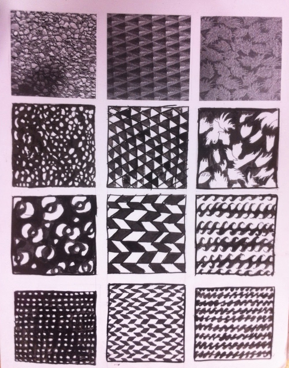
For this project, I tried to I created patterns from pictures that I took in class. I used space by overlapping things on top of each other, and to create texture, I just made the patterns smaller. Also, to create texture, I used hatching by crossing lines over other lines. I also used value in a a couple of them by adding some grey tones to create depth.
.jpeg) CRAFT: I paid attention to detail in this project by making sure that there weren't any smudges from the ink, and I tried to keep the lines as smooth as possible, and I tried not to get ink outside of the boxes.
CRAFT: I paid attention to detail in this project by making sure that there weren't any smudges from the ink, and I tried to keep the lines as smooth as possible, and I tried not to get ink outside of the boxes.MASTERY: I think I could have tried to make it a little neater by using a ruler. I also think that I could have added water to the ink to make the colors appear softer and not as stark.
RELATE: I think this assignment is similar to the portrait grayscale project just because we used ink in both of them and added value by adding water or more ink.
.jpeg)
.jpeg)
Geometric and Organic Shapes
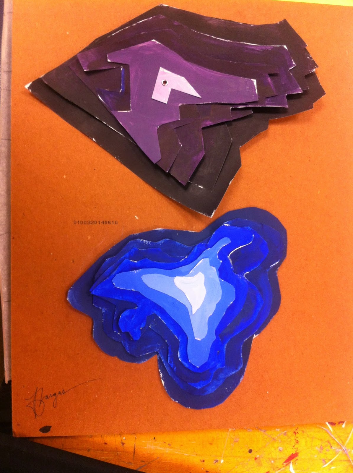
For this assignment, we created organic and geometric shapes. For the organic shapes, they are very smooth and curvilinear as opposed to geometric shapes, which are sharp and straight. In addition, I used value with color to create a gradient in each of these pieces. By adding white and black, I changed the colors to different tints and shades of the same color family. The further away the color was from the center, the more intense the color got. I created shades of the different colors by adding black, and I made tints by adding white.
CRAFT: For craftsmanship, I think I paid attention to detail with the color choices by making sure that there was a wide range of different colors in the same color family.
MASTERY: I think I could have made the colors a little more solid, just because the strokes from the paintbrush were visible. I also think I should have snipped off some of the white areas a little better as well.
RELATE: This assignment is very similar to the assignment where we painted the grayscale onto the strip of paper by just because we added black and white to create value. Adding black made a shade, and adding white made a tint.
Subscribe to:
Comments (Atom)


.jpeg)
.jpeg)

.jpeg)